
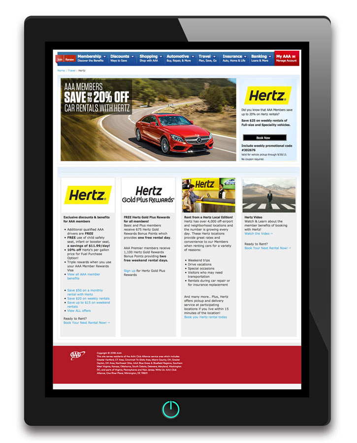
Original Page
This was the Hertz page as it appeared prior to revamp.
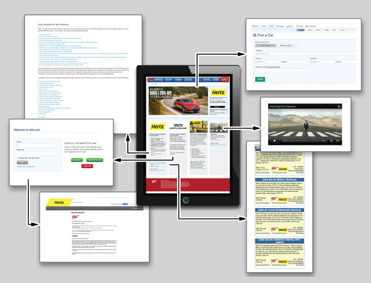
The Original's Navigational Structure
The main page, as you can see, branched off into several additional pages. It was evident that as the years passed, more slapped-on content began to undermine usability.
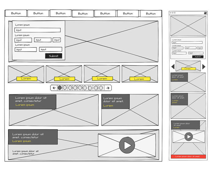
Wire-framing a Solution
A number of adjustments are sketched out in the above image. The three major changes:
1. Car Search
The form, arguably the most important item here, has been moved from a subpage unaccompanied by any motivating marketing, to a prominent spot on the home page.
2. Coupons
In the original version, all coupon links went to the same destination (a pdf popup containing ALL coupons). This was a frustrating experience for the end user so we addressed the individual coupons with a carousel presentation whereby each coupon would have its own dedicated URL. Simultaneously, we provided a clearly delineated "ALL COUPON" option.
3. The Video
An obvious interactive piece, we embedded the media right into the section it was designed to promote - The Gold Plus Rewards Program.
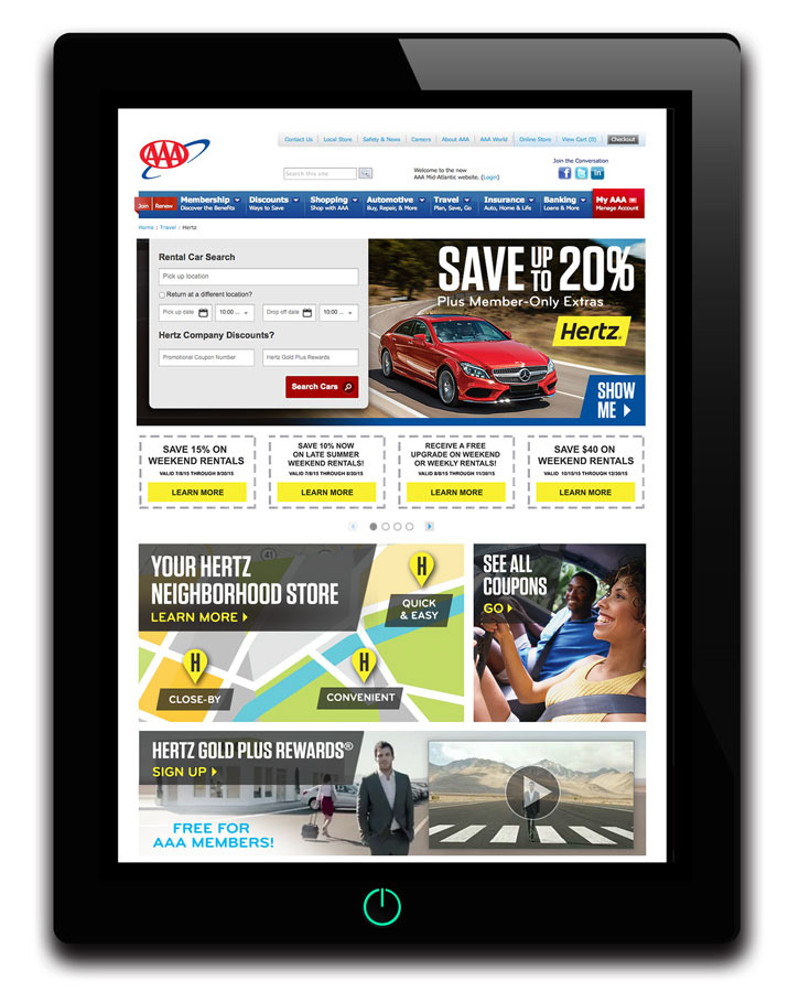
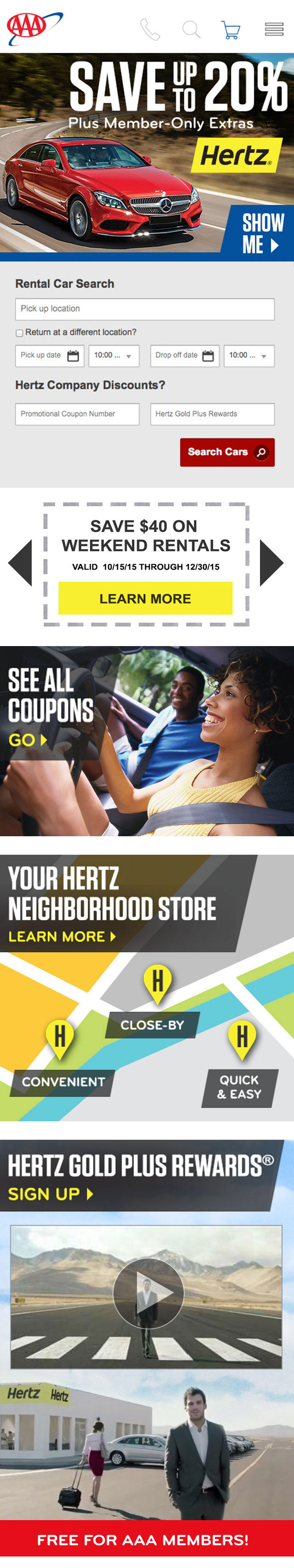
Revamped Page
This was the Hertz page (desktop view) upon completion.
The Mobile Version in its entirety
The main concision from the desktop was the single coupon appearance with side scrolling arrow graphics.